Car Dealership Website Redesign Project
Platform: Web Industry: Automobile Location: New Jersey
Summary
The client, a car dealer from Jack Daniel’s Porsche, was looking for a new website that appealed to a more updated clientele.
Drive Porsche Jersey is a personal website used by a Porsche dealer in order to increase sales and inform potential clientele. The design that was initially being used had an outdated style and was unclear in its navigation. This project aims to resolve these issues and provide the user with a clear browsing experience that is easier on the eyes.
Problems
Why the website needs a redesign
The website’s design and style did not match with Porsche’s brand image.
Unclear website navigation.
Target audience has changed in recent years, and the website did not reflect that change.
Research
I looked into other competitors and compared. I then decided the best way to rearrange the top navigation and what look and feel the website should go for. I also heard some pains from users and collected that data to revamp our website to make it more user friendly.
Project Goals
Lead users to navigate and ultimately sign the test drive form.
Remove unnecessary designs and copies to provide only important information in a straight forward manner.
Update the design to a cleaner and more simple style in accordance with the new target audience (female).
Reorder and reformat the website navigation.
Navigation
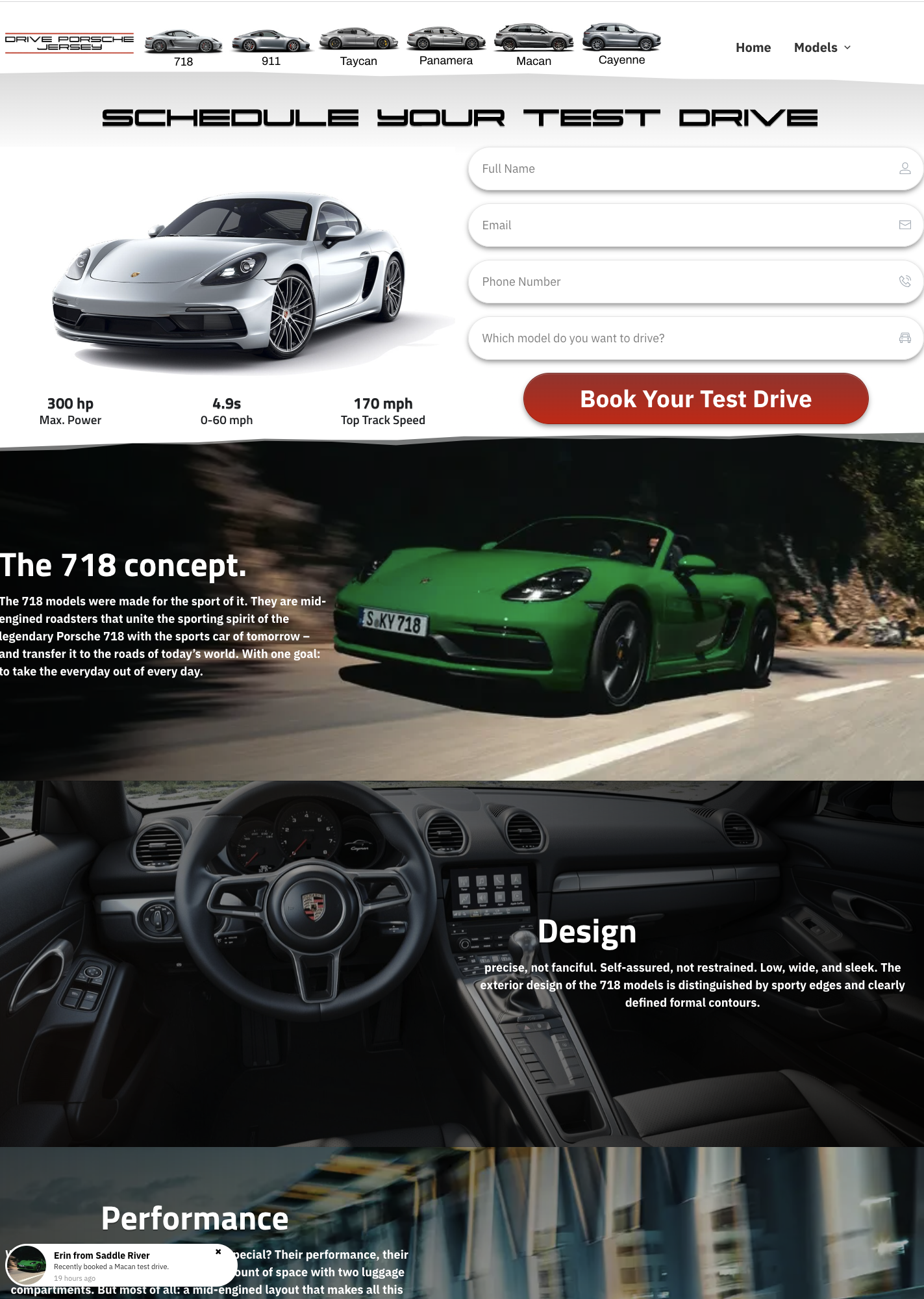
The original header contained menu items that served little purpose, with the “Models” menu consisting of the same information as shown in the center. The “Home” CTA also served the same purpose as the logo on the left-hand side.
Therefore, any CTA’s that did not serve a clear and specific purpose were removed in place of new ones that would lead to more important pages.
The logo was also changed, as the previous one took up too much real estate and was difficult to read.
WHY ORDER MATTERS - To lead users to sign up for the test drive, the CTA and location detail were placed on the top. Because this test drive is ONLY available in Upper Saddle River, NJ, I wanted to make sure this information was easy to catch for the users to prevent any customer dissatisfaction.
LESS IS MORE - Because the client wanted to give as much information to users visiting his site, the page looked very crowded. The goal was to update the page to be READABLE so users can grab the information they need and move forward with sign up. I removed repeated ‘Schedule for a Test Drive’ CTAs and copies that weren’t important for sign ups.
FROM STATIC TO CAROUSEL - The previous google review was just a static image with a link. Our goal was to keep users on the page. Therefore, I removed the CTA that linked out to google review and made the reviews into a carousel, so users can easily swipe and read different reviews without leaving the current page.
Homepage
Before
After
Model Detail Page
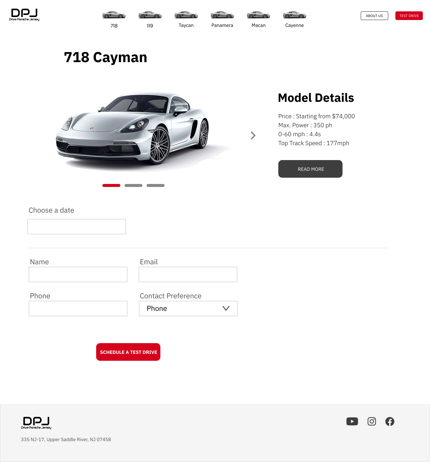
The old Model Detail Page had long feature modules and repeated components from the Homepage. I decided that it’s best to remove the images so the users don’t have to scroll up and down. Instead, I added model image carousels with model details section on the right. Users can click ‘read more’ to expand the details section.
It was designed for users to get all the model information in ONE glance and experience an easy sign up form by having a calendar pop-up to select a date and a drop down menu to choose contact preference. Contact preference is a new option that was added to create a personalized approach for customers.
Before
After
Carousel
Choose date from calendar
Contact preference
Test Drive Sign Up Page
Before, there was no separate page for users to sign up for a test drive. By having a designated test drive form page, any sub page that users are on, with one click, it will guide them to the sign up page. This is more functional, instead of going back to homepage and go all the way down to a sign up form. The page has only 6 fields and it’s easy to read at one glance.
About Us Page
There was no separate About Us page. Since this website is to increase car sales, the About Us Page helps to develop a relationship with customers and build trust by providing the brand’s information and story. To prevent a dead end page and increase sign up, a section to lead users to the test drive page was created.


